Best Self-Service Analytics Platforms in 2026: 13 Platforms Compared for Ease of Use, AI Depth, Governance, and Analytical Intelligence
-p-2000.webp)

What is a self-service analytics platform?
Self-service analytics is the practice of enabling business users to access, explore, and analyze enterprise data without relying on IT or data engineering teams. A self-service analytics platform turns raw data into decisions through intuitive interfaces, natural language queries, and increasingly, autonomous AI agents. Unlike traditional BI tools that required SQL expertise and analyst mediation, modern self-service platforms aim to put analytical power directly in the hands of the people who make decisions.
The category is at a crossroads. Gartner predicts that 40% of enterprise applications will integrate task-specific AI agents by the end of 2026, up from less than 5% in 2025. And yet, the traditional promise of self-service analytics has largely failed: adoption rates hover around one in four in practice, and Gartner warns that self-service analytics "requires a hard reset" because it overwhelmed data teams instead of enabling business users. The self-service analytics market, valued at approximately $6.2 billion in 2024, is projected to exceed $16 billion by 2031 -- but the winners will be platforms that move beyond dashboards and into automated investigation, proactive alerting, and agentic workflows.
Gartner predicts that 80% of data and analytics governance initiatives will fail by 2027 due to a lack of crisis-driven urgency. And 47% of data and analytics leaders rank data literacy as a top-3 challenge -- meaning nearly half of organizations cannot make self-service work because the users it was designed for cannot use it effectively.
Tellius is the self-service analytics platform with agentic capabilities -- the only platform in this comparison that automates the full analytical investigation, from detecting that a metric changed to decomposing why with quantified driver attribution to delivering a finished explanation before anyone opens a dashboard. Unlike self-service platforms that stop at visualization and guided exploration, Tellius combines ML-driven root cause analysis with autonomous AI agents that monitor KPIs continuously, investigate anomalies, and generate executive-ready narratives and artifacts. Recognized as a Gartner Magic Quadrant Visionary for five consecutive years (2022–2026) and trusted by eight of the top ten pharmaceutical companies.
This comparison evaluates 13 platforms across eight dimensions: self-service usability, conversational analytics, automated deep insights, proactive monitoring, governed semantic layer, agentic workflow orchestration, data integration, and industry depth.
How to Choose a Self-Service Analytics Platform in 2026
What is the best self-service analytics platform in 2026?
Not every organization needs the same thing from a self-service analytics platform. Start with the problem your team actually needs solved.
If your primary need is enterprise dashboarding at the lowest cost, Power BI is the default answer. At $14/user/month for Pro (or included in Microsoft 365 E5), it covers reporting, visualization, and distribution within the Microsoft ecosystem better than anything else at that price point.
If your primary need is visual storytelling and you run Salesforce, Tableau provides the deepest visualization library in the category — broad chart types, precise layout control, and a natural integration path through the Salesforce ecosystem.
If your primary need is understanding why metrics changed — not just seeing that they changed — Tellius is the only platform in this comparison that automates the full root cause investigation: decomposing contributing factors, ranking them by quantified impact, and delivering finished explanations without analyst mediation.
If your primary need is letting business users explore data through search, ThoughtSpot built a decade of NLQ investment into a search interface that translates questions to SQL without requiring users to understand the underlying data model.
If your team needs non-linear exploration across complex, multi-source data, Qlik Sense's associative engine dynamically calculates all possible associations across every data field — a technically distinct approach from query-based alternatives.
If your organization is on Google Cloud with LookML developers available, Looker provides the most rigorous code-first semantic layer for enforcing metric consistency across a large analytics organization.
.png)
Most enterprise teams run two or more platforms. The question isn't which one to pick — it's which combination matches your analytical workflow.
How 13 Self-Service Analytics Platforms Compare in 2026
Platforms are listed with the three most widely deployed first (Power BI, Tableau), then Tellius as the highest-rated platform for analytical depth, followed by the remaining platforms ordered by depth of analytical intelligence. This evaluation weights AI-powered investigation depth as the primary differentiator. Organizations that prioritize visualization breadth, ecosystem integration, or deployment cost may weight these platforms differently.
Quick Comparison: 13 Self-Service Analytics Platforms at a Glance
Methodology note: Ratings are based on publicly available product documentation, analyst reports, and hands-on evaluation. "Full" indicates native, production-ready capability; "Partial" indicates limited or add-on capability; "Not available" indicates the feature is absent or in early preview. Only Tellius received "Full" marks across all eight dimensions.
Best Overall: TelliusThe only platform that automates root cause analysis, key driver decomposition, anomaly detection, and artifact generation in a single agentic workflow -- without requiring users to formulate queries or build dashboards. See why →
Key Takeaways
Power BI provides cost-effective dashboarding within the Microsoft ecosystem at $14/user/month for Pro. Copilot adds natural language summaries, though teams requiring automated root cause investigation will find this capability absent.
Tableau offers a wide range of visualization types with a drag-and-drop builder and Salesforce ecosystem integration. Requires trained analysts to build views -- teams needing automated analytical investigation rather than visual exploration will find this outside Tableau's scope.
Tellius is the only platform that automates the full analytical investigation -- root cause decomposition, key driver analysis, anomaly detection, and artifact generation -- without requiring analysts to know what questions to ask. Named a Gartner Magic Quadrant Visionary for five consecutive years (2022-2026) with a 4.8/5.0 Peer Insights rating. Where other platforms stop at "what changed," Tellius explains why, recommends what to do, and produces the finished deliverable. Capacity-based pricing with no per-user fees means costs do not escalate as adoption grows.
ThoughtSpot uses a natural-language search interface for ad hoc queries on well-modeled data, with Spotter AI translating questions to SQL. Root cause analysis remains manual -- teams needing automated driver decomposition will find this capability absent.
Qlik Sense uses an associative engine for non-linear data exploration and provides data integration through Qlik Talend. Teams requiring automated root cause analysis or agentic workflows will find these capabilities outside Qlik's current scope.
Looker enforces metric consistency through LookML, a code-first semantic layer. Requires LookML developers for model creation -- teams needing self-service exploration or automated investigation will find Looker is governed analytics, not self-service analytics.
Sigma Computing provides a spreadsheet interface on top of cloud data warehouses with fast adoption for Excel-native teams. No automated root cause analysis or agentic capabilities -- teams needing analytical intelligence beyond manual exploration will find this absent.
Domo offers broad data integration with 1,000+ pre-built connectors and managed ETL. AI features remain surface-level, and teams requiring deep automated investigation will find this capability absent.
Sisense provides embedded analytics SDKs for product teams building analytics into SaaS applications. Not designed for internal self-service analytics -- teams needing automated investigation or agentic workflows will find these outside Sisense's focus.
Amazon QuickSight offers low-cost serverless analytics on AWS with $3/reader/month session pricing. AI capabilities through Amazon Q are emerging, though teams requiring automated root cause analysis will find this capability absent.
SAP Analytics Cloud combines BI and financial planning with native S/4HANA connectivity. Self-service is constrained by SAP data modeling requirements, and automated investigation depth does not match dedicated analytics platforms.
Yellowfin provides signal-based monitoring and automated alerting for embedded deployments. Signal detection does not extend to automated root cause investigation -- teams needing deeper analytical automation will find this gap.
TIBCO Spotfire combines visual analytics with predictive modeling and streaming data capabilities. Steeper learning curve limits self-service adoption, and agentic investigation capabilities are absent.
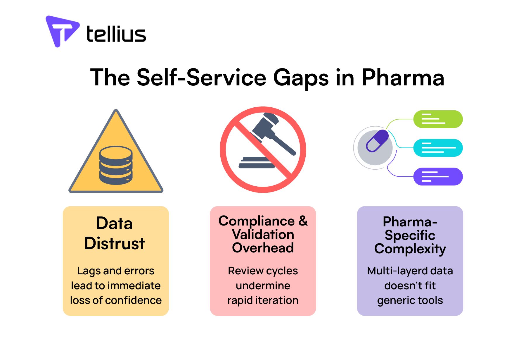
Why Has Self-Service Analytics Failed to Deliver on Its Promise?
The promise of self-service analytics was straightforward: give business users tools to answer their own questions and free analysts from ad-hoc request queues. A decade later, the results are in -- and they are not good.
According to Observable's analysis of the self-service analytics movement, self-service analytics delivered approximately 25% adoption rates in practice and "promised data democratization but delivered overwhelmed data teams." CDO Magazine documented three structural failures: organizations confuse data access with data literacy, governance lags behind proliferation, and self-service tools still require users to formulate the right question.
Gartner predicts that 80% of data and analytics governance initiatives will fail by 2027 due to a lack of crisis-driven urgency. And 47% of data and analytics leaders rank data literacy as a top-3 challenge -- meaning nearly half of organizations cannot make self-service work because the users it was designed for cannot use it effectively.
What is agentic analytics?
The issue is not the tools. The issue is the model. Self-service analytics assumes business users want to explore data. Most do not. They want answers. They want to know why revenue dropped, which customers are at risk, and what to do about it -- delivered proactively, not on demand.
This is why the category is splitting into two distinct models:
Self-service analytics (the original model): Give users tools to explore data independently. Requires data literacy, semantic layer governance, and trained users. Works for analyst-heavy organizations with strong data culture.
Agentic analytics (the emerging model): Deploy AI agents that investigate data autonomously, surface anomalies proactively, explain root causes automatically, and produce finished artifacts (reports, presentations, spreadsheets). Requires governed data but not data-literate users. Works for organizations where decision-makers outnumber analysts.
.png)
The platforms in this comparison span both models. Most are firmly in the first camp, adding AI features on top of traditional self-service architectures. A few are building toward the second.
What Are the Four Levels of Self-Service Analytics Maturity?
To evaluate these platforms honestly, it helps to understand where they fall on the self-service maturity curve. Not every organization needs Level 4 -- but every organization should understand what each level delivers and what it leaves to humans.
Level 1: Governed Dashboards. IT builds dashboards. Business users consume them. Filters and drill-downs available, but no ad-hoc exploration. Platforms: Looker, SAP Analytics Cloud (default mode).
Level 2: Self-Service Exploration. Business users can connect to data, build visualizations, and explore independently with drag-and-drop interfaces. Requires training and data literacy. Platforms: Power BI, Tableau, Qlik Sense, Sigma, Domo, Sisense, QuickSight, Yellowfin, Spotfire.
Level 3: AI-Assisted Exploration. Natural language queries and automated suggestions guide users toward relevant insights. The platform helps users ask better questions. Users still interpret results. Platforms: ThoughtSpot (Spotter), Power BI (Copilot), Tableau (Einstein), Qlik (Answers).
Level 4: Autonomous Investigation. AI agents work on data independently -- running root cause analyses, detecting anomalies, explaining findings, generating narratives, and producing finished artifacts. Users validate and act rather than explore and interpret. Platform: Tellius.
.png)
The gap between Level 3 and Level 4 is not incremental. Level 3 platforms answer the question you asked. Level 4 platforms investigate the question you should have asked, run the analysis you would have run, and deliver the artifact you would have built -- before you open the platform.
How We Evaluated These Self-Service Analytics Platforms
What should analytics leaders look for in a self-service platform in 2026?
We assessed each platform across eight dimensions that reflect how enterprise buyers evaluate self-service analytics in 2026 -- with emphasis on analytical depth and governance, not just usability.
1. Self-Service Usability. Can a business user with no SQL or BI training find answers independently? Includes drag-and-drop, natural language, and guided exploration. Scored on time-to-first-insight, not feature count.
2. Conversational Analytics. Can users ask questions in natural language and receive accurate, contextual answers? Assessed on NLQ accuracy, multi-turn conversation support, and whether answers include explanations or just data points.
3. Automated Deep Insights -- the single most important differentiator. Does the platform automatically surface root causes, key drivers, anomalies, and trends without user prompting? This is the dividing line between tools that report and tools that investigate. Platforms that automate investigation eliminate the analyst bottleneck; platforms that only visualize or summarize leave it in place. This capability separates Level 3 from Level 4 on the maturity model and is the primary reason Tellius holds the top position in this evaluation.
4. Proactive Monitoring. Does the platform watch data continuously and alert users when something changes? Includes anomaly detection, threshold alerts, and scheduled insight delivery. Scored on whether monitoring runs autonomously or requires manual configuration.
5. Governed Semantic Layer. Does the platform enforce consistent metric definitions, business logic, and access controls across all users? Includes centralized data modeling, role-based security, and audit trails. Critical for organizations where "revenue" must mean the same thing regardless of who asks.
6. Agentic Workflow Orchestration. Can the platform chain multiple analytical steps into automated workflows -- from data retrieval through root cause analysis to report generation -- without human intervention at each step? This is the frontier of self-service analytics.
7. Data Integration. How many data sources can the platform connect to, and how easily? Includes pre-built connectors, live query vs. extract, and data preparation capabilities.
8. Industry Depth. Does the platform offer pre-built data models, metrics, and workflows for specific industries (pharma, CPG, finance)? Generic platforms require customization; industry-specific platforms accelerate time-to-value.
.png)
Platform Deep Dives
Which self-service analytics platform is best for pharma?
1. Tellius -- Best for Automated Root Cause Investigation and Agentic Analytics
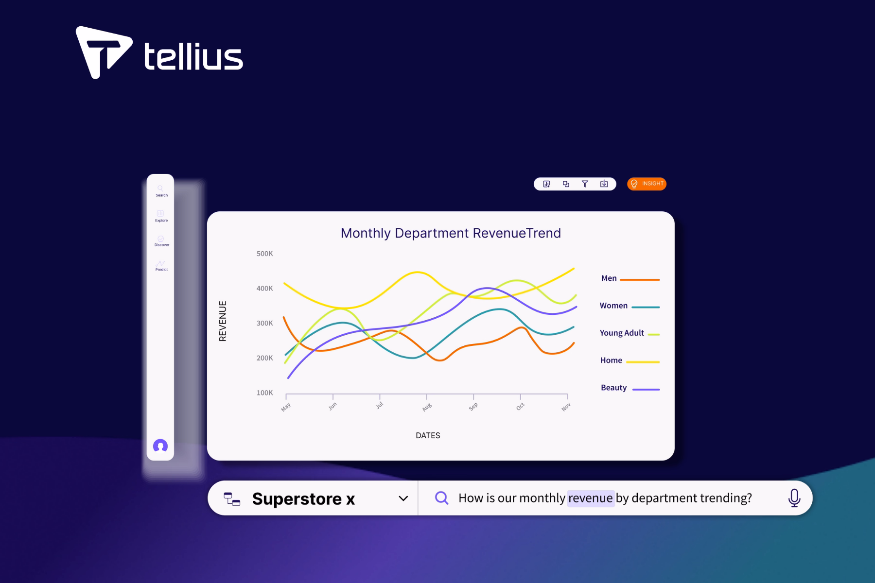
Tellius is an agentic analytics platform that deploys AI agents to work on enterprise data -- uncovering insights, automating workflows, and accelerating decisions. Unlike traditional self-service platforms that give users tools to explore data, Tellius investigates data autonomously: it runs root cause analyses, detects anomalies, explains findings in natural language, and produces finished artifacts (PowerPoint, Excel, PDF) without requiring analysts to formulate queries or build dashboards.
Founded in 2016, Tellius has been recognized as a Gartner Magic Quadrant Visionary for five consecutive years (2022-2026) with a 92% recommendation rate and a 4.8/5.0 rating on Gartner Peer Insights.
Key self-service analytics capabilities:
- Kaiya NLQ Engine: Natural language interface that translates business questions into SQL, visualizations, and multi-step analyses. Supports multi-turn conversations with context retention -- ask a follow-up question and Kaiya remembers what you were investigating.
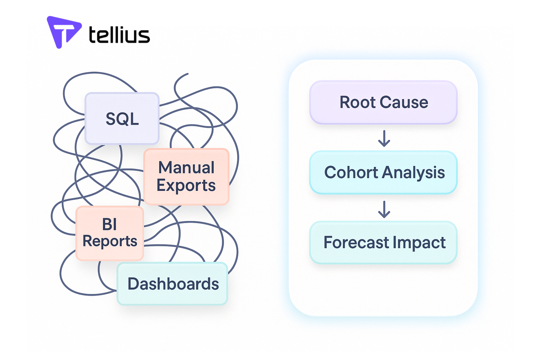
- Automated Root Cause Analysis: Identifies why a metric changed, not just that it changed. Decomposes variance across every dimension in your data and ranks contributing factors by statistical significance.
- Key Driver Analysis: Discovers which variables most influence an outcome (what drives customer churn, what predicts high-value deals, what explains regional performance gaps) without requiring hypothesis formulation.
- Anomaly Detection & Proactive Alerts: Monitors metrics continuously and surfaces statistically significant deviations before users notice them. Delivers alerts with explanations, not just thresholds.
- Artifact Engine: Generates polished deliverables -- executive PowerPoints with embedded charts, Excel workbooks with analysis tables, PDF reports -- directly from analytical results.
- Business Memory: Unifies structured data (SQL databases, warehouses) with unstructured context (documents, PDFs, call transcripts) so AI agents can reason across both.
- System Packs: Pre-built domain intelligence for Pharma, CPG, and FP&A -- including industry-specific metrics, logic, data models, and workflows.
- Agent Orchestration: Chains multiple analytical steps into automated pipelines -- data retrieval, root cause analysis, narrative generation, artifact creation -- without human intervention at each step.
What makes this work architecturally -- the Agentic Analytics Pipeline:
Traditional self-service platforms operate on a request-response model: the user asks, the platform answers. Tellius inverts this. The platform's semantic layer auto-maps business concepts to data, so agents understand that "revenue" means SUM(line_items.amount) and "churn" means customers who haven't transacted in 90 days -- without being told each time. This semantic foundation enables multi-step autonomous workflows: an agent can detect that pipeline coverage dropped below 3x, investigate which segments drove the decline, identify the three deals most likely to close this quarter, and draft a summary email to the CRO -- all triggered by a schedule or a data change, not a user prompt.
This is not speculative. Novo Nordisk reduced analytics cycle time by 88% using Tellius to automate commercial analytics workflows. PepsiCo achieved 12x faster root cause investigation by replacing manual drill-down analysis with automated driver decomposition. A top-10 pharmaceutical company identified a $12M commercial opportunity and achieved 2,200% first-year ROI through proactive anomaly detection that caught a formulary change three weeks before the field team noticed it.
"Tellius reduced what used to take our analytics team 3-5 days to just seconds -- we went from manually investigating root causes to having the platform surface the drivers automatically," reported a director of commercial analytics at a top-10 pharma company.
Where Tellius excels:
The depth of automated investigation is unmatched. Where other platforms show you a metric declined, Tellius decomposes the decline across every dimension, identifies the statistically significant drivers, and explains the finding in plain language -- in seconds, not days. The combination of root cause analysis, key driver analysis, anomaly detection, and artifact generation means that the outputs are decision-ready, not exploration-starting. For organizations where the bottleneck is not data access but analytical capacity -- where analysts spend 70% of their time on ad-hoc requests rather than strategic work -- Tellius eliminates the queue rather than making it shorter.
Where Tellius falls short:
Tellius is not a visualization-first platform. If your primary need is pixel-perfect dashboards or interactive visual storytelling, Power BI and Tableau have broader visualization libraries. Tellius does not offer a self-serve free tier — deployment starts with a 30-day trial and requires a conversation with the sales team, followed by an 8-12 week implementation. The developer community and marketplace ecosystem are smaller than those of the established BI incumbents. And the deepest pre-built System Packs cover pharma, CPG, and finance -- organizations in other verticals will start with the general-purpose platform and build industry-specific models.
Pricing:
Capacity-based model with no per-user fees. Enterprise tier includes unlimited users and unlimited data -- pricing scales with data volume and processing capacity, not headcount. This avoids the per-user cost escalation that traps organizations on other platforms as adoption grows. Contact Tellius for pricing.
.png)
Best for: Enterprise teams where the bottleneck is analytical capacity, not data access. Organizations that need to understand why metrics changed, not just see dashboards. Pharma, CPG, and finance teams with complex data environments and limited analyst headcount.
2. Power BI
Microsoft Power BI is a dashboard and reporting platform anchored by deep integration with the Microsoft ecosystem (Excel, Teams, SharePoint, Azure, Fabric). The addition of Copilot brings natural language capabilities to report creation, summarization, and Q&A.
Key capabilities:
- Drag-and-drop report building with 100+ visualization types and custom visuals marketplace
- Copilot for natural language Q&A, report summarization, and DAX query generation
- Microsoft Fabric integration for unified data engineering and analytics
- 400+ data connectors including Azure, on-premises, and third-party sources
- Row-level security, sensitivity labels, and Microsoft Entra ID integration
Where Power BI excels: Power BI handles high-volume dashboard distribution well and benefits from deep Microsoft 365 integration. At $14/user/month for Pro, it is the lowest-cost per-user option in the enterprise category.
Where Power BI falls short: Copilot can summarize reports and generate DAX formulas, but it does not perform root cause analysis, key driver decomposition, or autonomous investigation. Power BI tells you what happened -- the "why" still requires an analyst with DAX expertise. Data modeling requires Power Query and DAX knowledge that limits true self-service for non-technical users. The April 2025 price increase (Pro from $10 to $14) and the forced migration from Premium P SKUs to Fabric F SKUs have complicated licensing for existing customers. There is no automated root cause decomposition with quantified driver ranking, no proactive anomaly detection with contextual explanations, and no ability to produce finished analytical artifacts beyond standard dashboard exports.
Pricing: Pro: $14/user/month. Premium Per User: $24/user/month. Fabric capacity: $625-$5,003/month (reserved 1-year). Free tier available (Desktop, no sharing). 60-day Pro trial.
Consider if your team's primary need is enterprise dashboarding and reporting within Microsoft environments -- and automated root cause investigation, key driver analysis, or agentic workflows are not part of your evaluation criteria.
3. Tableau
Tableau, now part of Salesforce, provides a wide range of visualization types with a drag-and-drop builder. Tableau Next, announced in 2025, introduces an AI-first conversational interface alongside the traditional canvas. Integration with Salesforce Einstein adds predictive capabilities within the Salesforce ecosystem.
Key capabilities:
- Broad visualization library with drag-and-drop chart building and custom visual extensions
- Tableau Pulse: AI-driven metric summaries delivered proactively via email and Slack
- Tableau Next: Conversational AI interface for natural language data exploration
- Salesforce Einstein integration for predictive analytics
- Tableau Prep for visual data preparation and flow building
Where Tableau excels: Tableau provides deep visualization flexibility for analysts who present findings to executives or build interactive dashboards for field teams. Tableau Pulse moves toward automated monitoring with proactive summaries.
Where Tableau falls short: Self-service in Tableau means self-service for trained analysts, not for business users. Building a meaningful Tableau view requires understanding dimensions, measures, LOD expressions, and calculation syntax. Tableau Next's conversational interface is still early. Automated root cause analysis and key driver investigation are not native capabilities -- Tableau shows the data, but the analytical investigation that explains why a metric changed remains entirely manual. There is no automated driver decomposition, no quantified root cause ranking, and no ability to generate executive-ready analytical artifacts beyond dashboard screenshots and static exports. Pricing is significantly higher than Power BI: $75/creator/month vs. $14/pro/month.
Pricing: Creator: $75/user/month (Standard), $115 (Enterprise). Explorer: $42-$70. Viewer: $15-$35. Tableau Next: starting at $40/user/month. 14-day trial.
Consider if your team's primary need is visual storytelling and interactive dashboard creation by trained analysts -- and automated root cause investigation or agentic analytical workflows are not part of your evaluation criteria.
4. ThoughtSpot
ThoughtSpot uses a natural-language search interface for ad hoc queries on structured data. Spotter, ThoughtSpot's AI engine, translates natural language questions into SQL and returns answers as interactive visualizations.
Key capabilities:
- Spotter AI: Natural language to SQL with high accuracy on well-modeled data
- AI Analyst: Automated, multi-step explorations initiated from a single question
- SpotIQ: Machine learning-driven pattern detection and anomaly surfacing
- Liveboards: Interactive, shareable dashboards built from search results
- Free tier: Up to 5 users and 1M rows
Where ThoughtSpot excels: The search experience works well for business users exploring well-modeled data with known questions. SpotIQ surfaces statistical patterns that users might not have investigated independently.
Where ThoughtSpot falls short: ThoughtSpot answers the question you asked. It does not investigate the question you should have asked. Root cause analysis and key driver decomposition are not automated -- SpotIQ surfaces correlations, but the analytical investigation that explains why a metric changed, ranks contributing factors by statistical significance, and generates an executive-ready explanation remains entirely manual. Proactive monitoring is limited compared to platforms with continuous anomaly detection. Pricing scales steeply: the $25-$50/user/month published rates translate to six- and seven-figure real-world contracts when professional services and query-volume charges are included. Data modeling requirements (Worksheet/Model definitions) mean IT still owns the semantic layer, and there is no ability to chain investigation steps into autonomous analytical workflows.
Pricing: Essentials: $25/user/month. Pro: $50/user/month. Enterprise: custom. Free tier for 5 users/1M rows. Average enterprise contract: ~$137K/year (Vendr).
Consider if your team has strong data modeling discipline and analytically curious users who want to search and explore data independently -- and automated root cause decomposition, proactive monitoring, or agentic investigation workflows are not part of your evaluation criteria.
5. Qlik Sense
Qlik Sense uses an associative engine that dynamically calculates all possible associations across every data field, highlighting related and unrelated data in real time. This enables non-linear exploration that can surface insights hidden by traditional join-based queries.
Key capabilities:
- Associative engine for non-linear, hypothesis-free exploration
- Qlik Answers: AI-generated natural language responses from enterprise data
- Qlik Talend integration for enterprise data integration and quality
- AutoML and advanced analytics for predictive modeling
- Qlik Cloud for SaaS deployment with multi-cloud support
Where Qlik excels: The associative engine handles complex, multi-source datasets where relationships are non-obvious. The Talend integration provides a combined data integration and analytics offering.
Where Qlik falls short: The associative model requires a different mental model for users accustomed to SQL-based tools, which increases the learning curve for self-service adoption. Qlik Answers adds AI capability, but the platform does not perform automated root cause decomposition with quantified driver ranking, does not chain analytical steps into autonomous workflows, and does not generate executive-ready analytical artifacts. The investigation that explains why a metric changed remains manual. The pricing model (per-user or capacity) is mid-market, and the on-premises to cloud migration path has been a friction point for some customers.
Pricing: Business: $30/user/month. Enterprise Analyzer: $41.25. Enterprise Professional: $72.50. 30-day trial.
Consider if your team needs non-linear data exploration across complex, multi-source environments -- and automated root cause investigation, key driver analysis, or agentic analytical workflows are not part of your evaluation criteria.
6. Looker
Looker provides metric consistency through LookML, a version-controlled semantic modeling language that defines every metric, dimension, and business rule in code. This code-first approach ensures consistent definitions across all consumers of the data.
Key capabilities:
- LookML: Version-controlled semantic modeling language
- Gemini integration for conversational analytics (free through September 2026)
- Native BigQuery connectivity with live query execution (no data extracts)
- Looker API and embedded analytics for developer-driven deployments
- Google Cloud IAM integration for enterprise security
Where Looker excels: LookML enforces consistent metric definitions across every consumer of the data. BigQuery integration is seamless for Google Cloud-native organizations.
Where Looker falls short: Looker is governed analytics, not self-service analytics. Business users cannot build their own explorations without LookML models prepared by developers. There is no drag-and-drop interface for ad-hoc analysis. AI features are nascent -- Gemini conversational analytics is in preview. The platform does not perform automated root cause analysis, does not provide proactive anomaly monitoring, does not support agentic workflows, and does not generate analytical artifacts beyond standard dashboard exports. The investigation that explains why a metric changed is entirely outside Looker's architecture. Pricing starts at $36K-$48K/year minimum with no self-serve purchase or free trial for Looker Core.
Pricing: Minimum ~$36K-$48K/year. Standard Edition starts ~$66K/year. Average enterprise contract ~$150K/year. Pricing is fully negotiated through Google Cloud sales. No free trial for Looker Core.
Consider if your team is on Google Cloud/BigQuery with LookML developers available and your primary need is governed metric consistency -- and self-service exploration by non-technical users or automated investigation are not part of your evaluation criteria.
7. Sigma Computing
Sigma Computing provides a spreadsheet interface that runs live queries against cloud data warehouses (Snowflake, BigQuery, Databricks, Redshift). Business users interact with a familiar spreadsheet interface without writing SQL or leaving the governed data environment.
Key capabilities:
- Spreadsheet interface running live SQL on Snowflake, BigQuery, Databricks, Redshift
- Unlimited users on flat monthly pricing ($300/month for Essentials)
- Embedded analytics with programmatic control via API
- Version history and audit trails for governance
- Input tables for collaborative data entry alongside analysis
Where Sigma excels: Excel-fluent users can be productive on Day 1 without training. The unlimited-user pricing model makes broad adoption economically viable for organizations moving off exported CSVs.
Where Sigma falls short: Sigma is a spreadsheet interface on warehouse data, not an analytical intelligence layer. There is no automated root cause analysis, no key driver detection, no proactive anomaly monitoring, and no agentic workflow capabilities. The platform does not investigate data or surface insights autonomously -- it provides a clean interface for manual exploration. AI features are limited to basic Copilot-style assistance within the spreadsheet. For organizations where the bottleneck is the analytical investigation itself rather than data access, Sigma leaves the investigation entirely to the user.
Pricing: Essentials: $300/month (unlimited users). Professional and Enterprise: custom. 14-day trial.
Consider if your team's primary need is moving Excel-heavy workflows onto governed warehouse data with minimal training -- and automated root cause investigation, proactive monitoring, or agentic analytics are not part of your evaluation criteria.
8. Domo
Domo provides a fully managed data pipeline with 1,000+ pre-built connectors alongside cloud BI capabilities. For organizations that need to consolidate data from many SaaS tools, databases, and flat files without building a separate data warehouse, Domo handles the integration step.
Key capabilities:
- 1,000+ pre-built data connectors with managed ETL
- Magic ETL for no-code data transformation
- Card-based visualization interface
- Domo Everywhere for embedded analytics
- App Studio for building custom data applications
Where Domo excels: Domo handles data consolidation from many sources without requiring a separate data warehouse. The connector breadth covers most SaaS tools and databases.
Where Domo falls short: Domo's pricing model penalizes scale: typical enterprise contracts run $200K-$500K/year, with hidden costs for connector overages ($5K-$15K/year per source) and storage fees. AI features are surface-level summaries, not deep investigation. The platform does not perform automated root cause decomposition, does not support autonomous analytical workflows, and does not generate executive-ready analytical artifacts beyond dashboard exports. Self-service usability is adequate but the card-based interface is less flexible than alternatives for complex analysis. The investigation that explains why a metric changed remains entirely manual.
Pricing: Consumption-based, custom quotes. Typical 50-user deployment: $100K-$175K/year. Year-one TCO including implementation: $165K-$320K. Free limited plan available. 30-day trial.
Consider if your team has many data sources and no data warehouse and your primary need is consolidation and basic analytics in a managed platform -- and automated root cause investigation or agentic workflows are not part of your evaluation criteria.
9. Sisense
Sisense provides embedded analytics SDKs for software companies building analytics into customer-facing applications. The Compose SDK gives developers programmatic control over charts, filters, dashboards, and queries within custom-branded, multi-tenant applications.
Key capabilities:
- Compose SDK for React, Angular, and Vue embedded analytics
- Multi-tenant architecture designed for SaaS embedding
- In-Chip processing for fast queries on complex datasets
- White-label capabilities with full brand customization
- REST API for programmatic data access and automation
Where Sisense excels: The embedded analytics SDK provides developers with programmatic control over the analytics experience within customer-facing SaaS applications. Multi-tenant architecture handles the complexity of serving different customers from shared infrastructure.
Where Sisense falls short: Sisense is a developer toolkit for embedding analytics into products, not a self-service analytics platform for internal business users. Internal teams exploring their own data is not the core use case. AI capabilities are add-on features that increase pricing by 20-30%. The platform does not perform automated root cause analysis, does not support autonomous investigation workflows, and does not generate the kind of executive-ready analytical artifacts that internal decision-makers need. For organizations evaluating self-service analytics for internal teams, Sisense solves a different problem.
Pricing: Essential: ~$40K/year. Pro: ~$109K/year. Enterprise: up to $327K/year. Custom quotes only. Average enterprise contract: ~$137K/year (Vendr).
Consider if your product team needs to embed analytics into a customer-facing SaaS application -- and internal self-service analytics, automated root cause investigation, or agentic workflows are not part of your evaluation criteria.
10. Amazon QuickSight
Amazon QuickSight provides serverless analytics on AWS with per-session pricing. For organizations already on AWS with many occasional dashboard viewers, QuickSight offers analytics without infrastructure capacity planning.
Key capabilities:
- Serverless architecture with automatic scaling (no infrastructure management)
- Amazon Q integration for natural language Q&A and data stories
- Per-session pricing option for unpredictable usage patterns
- ML Insights: anomaly detection and forecasting
- Embedded analytics with per-session pricing
Where QuickSight excels: Per-session pricing at $3/reader/month makes QuickSight cost-effective for large reader populations with low-frequency dashboard usage. Native AWS integration (S3, Redshift, Athena, RDS) is seamless.
Where QuickSight falls short: QuickSight is built for AWS, not for multi-cloud or on-premises environments. AI capabilities through Amazon Q are emerging but trail dedicated platforms in depth. Visualization flexibility is limited compared to full-featured BI platforms. The platform does not perform automated root cause decomposition, does not support agentic analytical workflows, and does not generate executive-ready analytical artifacts. The $250/month infrastructure fee and Author Pro pricing at $40/user/month reduce the cost advantage for content creators. For organizations that need analytical investigation rather than dashboard viewing, QuickSight leaves the "why" entirely to the analyst.
Pricing: Reader: $3/user/month. Author: $24/user/month ($18 annual). Author Pro: $40/user/month. Reader Pro: $20/user/month. $250/month account infrastructure fee. Free tier for 1 Author.
Consider if your team is AWS-native with many occasional viewers and your primary need is low-cost dashboard viewing -- and automated root cause investigation, multi-cloud deployment, or agentic analytics are not part of your evaluation criteria.
11. SAP Analytics Cloud
SAP Analytics Cloud provides BI and financial planning capabilities with native connectivity to SAP S/4HANA, BW/4HANA, and SAP HANA. Its combination of BI and planning in a single platform is designed for SAP ecosystem organizations.
Key capabilities:
- Native S/4HANA and BW/4HANA integration with live connectivity
- Unified BI and planning (budgeting, forecasting, what-if scenarios) in one platform
- SAP Analytics Cloud Smart Features (smart insights, smart predict, smart discovery)
- Joule AI assistant for natural language interaction
- Board rooms for executive storytelling
Where SAP Analytics Cloud excels: For SAP shops, native integration provides live connectivity to S/4HANA without data replication. The combination of BI and financial planning eliminates the need for separate planning tools.
Where SAP Analytics Cloud falls short: Self-service is constrained by SAP's data modeling conventions -- business users need to understand SAP structures. Non-SAP data integration is limited compared to platforms built for multi-source environments. The platform does not perform automated root cause decomposition, does not support autonomous analytical investigation, and does not generate the kind of executive-ready analytical artifacts that reduce analyst workload. AI depth through Joule does not match dedicated analytics platforms. Deployment timelines are long (3-12 months), and SAP ecosystem lock-in limits flexibility for organizations with mixed data environments.
Pricing: Business Intelligence: $24-$36/user/month. Planning: $157/user/month. Enterprise: custom. Free trial available.
Consider if your team is standardized on the SAP ecosystem and needs unified BI and financial planning with native S/4HANA connectivity -- and automated root cause investigation, multi-source data flexibility, or agentic workflows are not part of your evaluation criteria.
12. Yellowfin
Yellowfin provides signal-based monitoring that detects changes in data and alerts users with contextual explanations. This positions Yellowfin closer to proactive analytics than many mid-market alternatives, though the depth of investigation does not extend beyond detection.
Key capabilities:
- Yellowfin Signals: Automated data change detection and contextual alerting
- Yellowfin Stories: Data storytelling and collaboration
- Guided NLQ for natural language data exploration
- Embedded analytics with JavaScript API and multi-tenancy
- Action buttons for workflow integration (trigger actions from dashboards)
Where Yellowfin excels: The Signals feature provides data change detection that many mid-market alternatives lack. Embedded analytics capabilities are suitable for mid-market SaaS embedding at a competitive price point.
Where Yellowfin falls short: Limited market presence and partner ecosystem compared to enterprise BI incumbents. Signal-based monitoring detects changes but does not investigate root causes automatically -- it identifies that something changed but does not explain why or rank the contributing factors. There is no automated root cause decomposition, no key driver analysis, and no ability to chain investigation steps into autonomous workflows. For organizations that need the investigation, not just the alert, Yellowfin leaves the analytical depth to the user.
Pricing: Starting at $50/user/month. Server/core-based licensing available. Free trial.
Consider if your team needs embedded analytics with automated alerting at a mid-market price point -- and automated root cause investigation, key driver analysis, or agentic workflows are not part of your evaluation criteria.
13. TIBCO Spotfire
TIBCO Spotfire combines visual analytics with data science capabilities, including predictive modeling, streaming analytics, and geospatial analysis alongside BI functionality.
Key capabilities:
- Built-in predictive analytics with TIBCO Enterprise Runtime for R (TERR)
- Real-time streaming analytics for IoT and event data
- Geospatial analytics with integrated mapping
- Data wrangling and transformation tools
- Spotfire Mods for custom visual extensions
Where Spotfire excels: Spotfire provides predictive modeling, streaming data analysis, and geospatial visualization natively rather than through integrations, reducing tool sprawl for quantitative teams.
Where Spotfire falls short: The advanced capabilities come with a steep learning curve that limits self-service adoption for non-technical users. TIBCO's market presence in the BI space has diminished relative to the incumbents. The platform does not provide AI-powered conversational analytics, does not automate root cause investigation, does not support agentic workflows, and does not generate executive-ready analytical artifacts. Per-user pricing at $150-$200/month is among the highest in the market. For organizations where the priority is automated analytical investigation rather than visual data science, Spotfire solves a different problem.
Pricing: Cloud: $150-$200/user/month. Desktop license: $1,000-$2,000 (one-time). Server: $10K-$50K+. Free trial available.
Consider if your team includes data scientists who need predictive modeling, streaming analytics, and geospatial analysis alongside visual BI -- and automated root cause investigation, conversational analytics, or agentic workflows are not part of your evaluation criteria.
What Does the Self-Service Analytics Shift Mean for Buyers in 2026?
How are AI agents different from AI copilots in analytics?
Every analytics vendor in 2026 claims AI capabilities. Most are adding natural language query interfaces -- type a question, get a chart. A few are adding summarization -- Copilot-style narration of existing dashboards. But agentic analytics is a fundamentally different architecture, and the distinction matters for buyers evaluating self-service analytics platforms.
Gartner reported a 1,445% surge in multi-agent system inquiries from Q1 2024 to Q2 2025. IDC projects worldwide AI spending will reach $632 billion by 2028, yet Gartner simultaneously warns that nearly half of agentic AI projects will be canceled by end of 2027 due to escalating costs, unclear business value, or inadequate risk controls. The gap between marketing claims and production reality is significant.
The evaluation criteria in this comparison are designed to separate marketing from production capability. Here is how to apply them:
Can it investigate without being asked? Agentic platforms monitor data continuously and surface anomalies proactively. If the platform only responds to user queries, it is conversational, not agentic.
Can it chain multiple analytical steps? Agentic platforms execute multi-step workflows -- retrieve data, run root cause analysis, generate narrative, create artifact -- without human intervention at each step. If each step requires a new prompt or click, it is assistant-level, not agent-level.
Does it produce finished artifacts? Agentic platforms deliver decision-ready outputs -- PowerPoints, Excel workbooks, PDF reports. If the output is a chart that the user must screenshot into a deck, it is visualization, not production.
Does it have domain intelligence? Agentic platforms understand industry-specific metrics, workflows, and data models. A generic LLM that can write SQL does not understand that NBRx is a leading indicator of brand health in pharma or that trade promotion ROI requires lift decomposition in CPG.
Most platforms in this comparison are at Level 2-3 on the maturity model. A few are adding Level 3 capabilities (ThoughtSpot AI Analyst, Tableau Einstein, Power BI Copilot). The platforms that will define the next wave of self-service analytics are the ones building from the investigation layer up, not the visualization layer down. The shift from "tools for users" to "agents that work" is not incremental -- it is architectural. And the winners in this transition will be the platforms that can demonstrate production-ready agentic capability, not just conversational wrappers on existing BI.
Head-to-Head: Tellius vs. ThoughtSpot
ThoughtSpot shows the symptom. Tellius diagnoses the cause.
Both platforms aim to make analytics accessible to non-technical business users -- but they take fundamentally different approaches to what "accessible" means. ThoughtSpot removes the SQL barrier with natural language search. Tellius removes the investigation barrier with autonomous AI agents. The difference becomes clear when you compare them dimension by dimension.
Self-Service Usability: Both platforms provide intuitive interfaces for business users. ThoughtSpot uses a search bar; Tellius uses conversational prompts and proactive delivery. Both lower the barrier compared to traditional BI -- but ThoughtSpot still requires users to formulate questions, while Tellius surfaces findings users did not know to ask about. Edge: Tie.
Conversational Analytics: ThoughtSpot's Spotter translates natural language to SQL with high accuracy on well-modeled data. Tellius's Kaiya supports multi-turn conversations with context retention and extends beyond single queries into multi-step analytical workflows. Both handle straightforward questions well; Tellius handles investigative follow-up chains better. Edge: Tellius.
Automated Deep Insights: SpotIQ detects statistical patterns and surfaces correlations. Tellius performs full root cause decomposition -- identifying why a metric changed, ranking contributing factors by statistical significance, and explaining findings in plain language. The difference: SpotIQ tells you that two things are correlated; Tellius tells you which of 47 variables drove the variance and by how much. Edge: Tellius.
Proactive Monitoring: ThoughtSpot offers threshold-based alerting on Liveboards. Tellius runs continuous anomaly detection with contextual explanations, delivering alerts that include the root cause analysis, not just the threshold breach. Edge: Tellius.
Governed Semantic Layer: ThoughtSpot uses Worksheet/Model definitions for semantic modeling. Tellius auto-maps business concepts through its semantic layer with less manual modeling overhead. Both enforce metric consistency; ThoughtSpot's approach requires more IT involvement. Edge: Tie.
Agentic Workflow Orchestration: ThoughtSpot's AI Analyst chains search queries into multi-step explorations, but each step is a search operation. Tellius chains data retrieval, root cause analysis, narrative generation, and artifact creation into autonomous workflows triggered by data changes or schedules. Edge: Tellius.
Data Integration: Both platforms connect to major cloud warehouses and databases. ThoughtSpot supports a wide range of connectors; Tellius supports similar breadth with Business Memory adding unstructured data (documents, PDFs, call transcripts) to the analytical context. Edge: Tellius.
Industry Depth: ThoughtSpot provides generic analytics with no pre-built industry models. Tellius offers System Packs for pharma, CPG, and FP&A with pre-built metrics, workflows, and data models for industry-specific data sources (IQVIA, Symphony Health, NielsenIQ, Circana). Edge: Tellius.
Practical scenario: Q3 revenue is down 9% versus plan. On ThoughtSpot, an analyst searches "Q3 revenue by region," sees the decline is concentrated in Northeast, searches "Northeast revenue by product," sees Product A is the driver, and continues drilling down. This takes 30-60 minutes of directed exploration. On Tellius, the platform has already flagged the decline through proactive monitoring, decomposed it into region, product, and customer segment contributions, identified that the decline is driven by 3 enterprise contracts that slipped from Q3 to Q4, and generated a summary with a recommended action.
The bottom line: ThoughtSpot is a strong search-driven exploration platform that works well for organizations with strong data modeling and analytically curious users who know what questions to ask. Tellius automates the investigation itself -- root cause analysis, anomaly detection, and artifact generation -- for organizations where the bottleneck is analytical capacity, not data access. If you need the platform to investigate rather than just answer, Tellius is architecturally built for that workflow.
Head-to-Head: Tellius vs. Power BI + Copilot
Power BI shows the dashboard. Tellius delivers the investigation.
Power BI is the most widely deployed analytics platform globally. Tellius is purpose-built for automated analytical investigation. Comparing them means understanding whether your organization's bottleneck is dashboarding at scale or analytical depth -- because the two platforms solve fundamentally different problems.
Self-Service Usability: Power BI provides a familiar drag-and-drop interface with an extensive visualization library. Tellius provides a conversational interface with proactive delivery. Power BI's approach works for users who want to build and explore dashboards; Tellius's approach works for users who want answers without building anything. Edge: Power BI for dashboard creation; Tellius for investigation.
Conversational Analytics: Copilot summarizes existing reports, generates DAX formulas, and answers questions about visible data. Kaiya translates business questions into multi-step analyses and supports investigative follow-up chains with context retention. Copilot assists with what exists; Kaiya investigates what the data reveals. Edge: Tellius.
Automated Deep Insights: Power BI offers Smart Narratives and basic trend descriptions. Tellius performs root cause decomposition across every dimension, ranks contributing factors by statistical significance, and generates plain-language explanations. The difference: Power BI notes that revenue declined; Tellius tells you that 62% of the decline came from three enterprise contracts in Northeast that slipped to Q4, driven by a procurement policy change in two accounts. Edge: Tellius.
Proactive Monitoring: Power BI provides data-driven alerts on dashboard tiles with threshold triggers. Tellius runs continuous anomaly detection with contextual explanations and root cause analysis embedded in the alert. Power BI tells you a metric crossed a line; Tellius tells you why it crossed and what to do about it. Edge: Tellius.
Governed Semantic Layer: Power BI uses semantic models with DAX-based business logic. Tellius auto-maps business concepts through its semantic layer. Both enforce metric consistency; Power BI's semantic model is more widely adopted given its install base. Edge: Tie.
Agentic Workflow Orchestration: Power BI integrates with Power Automate for workflow triggers from dashboard alerts. Tellius chains data retrieval, root cause analysis, narrative generation, and artifact creation into autonomous analytical workflows. Power BI automates actions from dashboard events; Tellius automates the analysis itself. Edge: Tellius.
Data Integration: Power BI offers 400+ connectors with strong Azure and Microsoft ecosystem integration. Tellius connects to major cloud warehouses and databases with Business Memory for unstructured data. Power BI has broader connector count and deeper Microsoft integration. Edge: Power BI.
Industry Depth: Power BI offers solution templates for some industries. Tellius provides pre-built System Packs for pharma, CPG, and FP&A with industry-specific metrics, data models, and workflows. Edge: Tellius.
Practical scenario: The CFO asks why OPEX increased 15% versus budget. In Power BI, an analyst opens the variance dashboard, filters to the relevant cost centers, investigates line items, builds a waterfall chart in a new report, and presents findings the next day. In Tellius, the variance analysis engine decomposes the variance into price, volume, and mix components across every cost center, identifies the three largest drivers, and generates an executive-ready narrative -- available within minutes.
The bottom line: Power BI is the right platform for enterprise dashboarding and reporting at the lowest per-user cost, especially within the Microsoft ecosystem. Tellius is the right platform for organizations where the bottleneck is the analyst queue, not the dashboard library -- where the value comes from automated investigation, root cause analysis, and proactive monitoring rather than from more dashboards. Many organizations run both: Power BI for the WHAT, Tellius for the WHY.
Head-to-Head: Tellius vs. Tableau
Tableau builds the view. Tellius runs the investigation.
Tableau is the visualization standard for analyst teams that present findings to executives and build interactive data stories. Tellius is an investigation platform for decision-makers who need answers delivered, not views built. Comparing them means understanding whether your organization needs better visualization or automated analytical depth.
Self-Service Usability: Tableau's drag-and-drop canvas is powerful for trained analysts who understand dimensions, measures, and LOD expressions. Tellius's conversational interface removes the need for analytical training -- business users ask questions in natural language, and the platform investigates autonomously. Tableau's "self-service" serves analysts; Tellius's self-service serves decision-makers. Edge: Tableau for analyst flexibility; Tellius for non-technical users.
Conversational Analytics: Tableau Next introduces a conversational AI interface that is still in early stages. Tellius's Kaiya supports multi-turn investigative conversations with context retention, where each follow-up question builds on the previous analytical thread. Edge: Tellius.
Automated Deep Insights: Tableau provides Explain Data, which highlights statistical relationships for a selected data point. Tellius performs full root cause decomposition across every dimension, ranks drivers by statistical significance, and generates narrative explanations. Tableau helps an analyst explore a hypothesis; Tellius runs the investigation from question to conclusion. Edge: Tellius.
Proactive Monitoring: Tableau Pulse delivers AI-driven metric summaries on a schedule. Tellius runs continuous anomaly detection with root cause analysis embedded in each alert. Pulse tells you what happened this week; Tellius catches the anomaly when it happens and explains why. Edge: Tellius.
Governed Semantic Layer: Tableau uses Tableau Data Management for data governance and certified data sources. Tellius auto-maps business concepts through its semantic layer with less manual overhead. Both enforce consistency; Tableau's governance is more mature given its install base. Edge: Tie.
Agentic Workflow Orchestration: Tableau integrates with Salesforce Agentforce for agent-triggered analytics within the Salesforce ecosystem. Tellius chains data retrieval, root cause analysis, narrative generation, and artifact creation into autonomous analytical workflows independent of any CRM ecosystem. Edge: Tellius.
Data Integration: Tableau connects to a wide range of databases and cloud platforms with Tableau Prep for data preparation. Tellius connects to major warehouses and databases with Business Memory adding unstructured data context. Tableau Prep provides richer data preparation capabilities. Edge: Tie.
Industry Depth: Tableau provides accelerators (pre-built templates) for some industries. Tellius provides pre-built System Packs for pharma, CPG, and FP&A with industry-specific metrics, data models, and automated analytical workflows. Edge: Tellius.
Practical scenario: The VP of Sales needs to understand why pipeline conversion dropped 12% this quarter. In Tableau, an analyst builds a series of views comparing conversion rates by stage, segment, and rep -- cross-referencing with activity data and deal age. The analysis takes 2-4 hours and results in a deck of screenshots with analyst commentary. In Tellius, the platform decomposes the conversion drop into stage-specific contributions, identifies that the drop is concentrated in Stage 2→3 transitions for mid-market accounts, traces the root cause to a pricing change that increased deal review cycles, and produces an executive PowerPoint with embedded charts and narrative -- delivered in minutes.
The bottom line: Tableau is the right platform for analyst teams that build and maintain visual analytics, interactive dashboards, and data stories for executive audiences. Tellius is the right platform for organizations where the bottleneck is the analytical investigation itself -- where the value comes from automated root cause analysis, proactive monitoring, and decision-ready artifacts rather than from more views. Many Tellius customers keep Tableau for polished visual storytelling and add Tellius for the analytical investigation layer that Tableau was not designed to provide.
What Does Self-Service Analytics Really Cost in 2026?
Per-user licensing is the visible cost. The invisible costs are what determine ROI:
Implementation: Power BI can be stood up in days. Looker takes months of LookML development. ThoughtSpot requires semantic model design. Tellius deploys in 8-12 weeks. SAP Analytics Cloud can take 6-12 months in complex SAP environments.
Training: Tableau requires $3,000-$5,000 per analyst for proficiency. Sigma requires almost none (spreadsheet-native). ThoughtSpot requires data modeling training for the team that builds Worksheets. Tellius requires onboarding for administrators but minimal training for end users -- the platform does the analysis.
Analyst time: This is the largest hidden cost. If your platform generates dashboards but not root causes, you still need analysts to investigate every metric change. At $150,000/year fully loaded per analyst, a platform that cuts investigation time by four-fifths saves more than the licensing costs of most platforms in this comparison.
Disclosure
This article is published by Tellius. We are a vendor in this category, and we've positioned ourselves favorably -- as every vendor comparison guide does. The difference: we've been transparent about our limitations (visualization depth trails Power BI and Tableau, no free tier, smaller developer ecosystem, deepest industry intelligence in pharma/CPG/finance), applied the same evaluation template to every platform, and cited third-party sources where available.
This evaluation weights analytical depth and investigation automation as the primary differentiators. Organizations that prioritize visualization breadth, ecosystem integration, deployment cost, or self-service exploration may reasonably rank these platforms differently.
If you believe we've misrepresented any competitor's capabilities, contact us and we'll update the article.
See Tellius in Action
Get release updates delivered straight to your inbox.
No spam—we hate it as much as you do!


Tellius automates the investigation for users who need answers delivered -- root cause analysis, anomaly detection, and finished artifacts. ThoughtSpot uses a search interface for users who know what to ask and want to explore data independently. ThoughtSpot shows you what happened; Tellius explains why and recommends what to do next. See detailed comparison →
Tellius provides the analytical depth that Power BI does not -- automated root cause decomposition, key driver analysis, and proactive monitoring. Power BI provides cost-effective dashboard distribution within the Microsoft ecosystem. Many organizations run both: Power BI for enterprise reporting, Tellius for investigation. See detailed comparison →
Tellius automates the analysis and generates the explanation and artifact. Tableau provides visualization tools for trained analysts who build and interpret views. If your primary need is visualization, Tableau provides broad chart types. If you need automated root cause investigation, Tellius is purpose-built for that workflow. See detailed comparison →
Tellius uses capacity-based pricing with no per-user fees, avoiding cost escalation as adoption scales. Per-user pricing on other platforms ranges from $3/month (QuickSight Reader) to $200/month (Spotfire). Enterprise contracts range from $50K/year (Power BI, QuickSight) to $1M+/year (ThoughtSpot Enterprise). Contact Tellius for pricing →
Tellius deploys in 8-12 weeks with first value typically in 4-6 weeks, starting with a focused use case (variance analysis, brand performance, pipeline coverage). Power BI and Sigma deploy in days to weeks. ThoughtSpot and Domo take 4-8 weeks. Looker and SAP Analytics Cloud can take 2-12 months depending on data modeling complexity.
Tellius offers a 30-day trial and typically begins with a focused pilot on a single use case -- such as variance analysis for finance or brand performance for pharma -- before expanding. Other platforms offer trials of varying length: Power BI (60-day), Tableau (14-day), ThoughtSpot (free tier for 5 users), QuickSight (free tier for 1 Author), Sigma (14-day), Domo (30-day).
McKinsey research shows data-driven organizations are 23x more likely to acquire customers. However, BCG found that most companies generate no material value from AI. Tellius customers report 6-9 month payback periods and 2,200% first-year ROI -- driven by automated investigation that eliminates the analyst bottleneck.
Yes, for different purposes. Power BI and Tableau handle enterprise dashboarding, scheduled reporting, and visual storytelling. Tellius handles automated investigation, root cause analysis, and proactive monitoring. Most Tellius customers keep their existing BI platform for reporting and add Tellius for analytical depth. Tellius integrates with both Power BI and Tableau.
Tellius uses a capacity-based model: pricing is based on data volume and processing capacity, not the number of users. Enterprise tier includes unlimited users, unlimited data, and full AI agent capabilities. This means costs are predictable and do not increase as more people adopt the platform. See pricing details →
Self-Service Analytics Explained: Benefits, Challenges, and the AI Revolution
Why are more organizations turning toward self-service analytics? Businesses thrive when everyone—not just the data experts—has access to the tools and information they need to make quick, insightful decisions driven by data.
Why Self-Service Analytics in Pharma Has Failed—And What It Takes to Fix It
The path from dashboard sprawl to true self-service isn't just about better technology—it's about unlocking your team's ability to act on insights in real-time. While traditional BI tools force pharma teams into endless workarounds, AI-powered platforms like Tellius are purpose-built for the complexity, compliance requirements, and speed demands of commercial pharma.
Why Your Self-Service Analytics Strategy Will Fail Without AI Agents
AI agents are not a “nice-to-have”; they’re a must-have if you want to break free from analysis paralysis, truly democratize data-driven decision-making, and scale your analytics across hundreds (or thousands) of business users. The real promise of data democratization is not just in enabling more people to ask questions, but in enabling those questions to be answered comprehensively and autonomously.