

Best FP&A Software in 2026: The Tools That Plan, and the Layer That Explains Why

FP&A software is the set of platforms finance teams use to run planning, budgeting, forecasting, consolidation and close, and management reporting. The market is packed with capable planning tools, but far fewer of them actually explain why the numbers moved once the month closes — and the ones that try aren't built the same way underneath. The best-known planning names — Anaplan, Workday Adaptive Planning, Oracle Cloud EPM, OneStream, Pigment, Vena, and others — are strong at turning assumptions into a model, a budget, and a board-ready plan; picking among them comes down to your company size, how attached your team is to Excel, and how complex your modeling needs to be. But once the plan exists, what explains the variance against it — automatically, with an AI agent doing the legwork across the granular data instead of an analyst spending three days in spreadsheets? That's a different job from planning, and it's the one finance teams still do by hand.
This guide covers both. Below is how the planning market breaks down by tier, followed by the diagnosis gap that sits on top of all of it.
How the FP&A software market breaks down in 2026
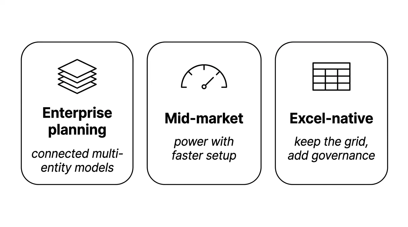
If you need connected, multi-entity enterprise planning that ties finance to sales, supply chain, and workforce, the platforms built for it are Anaplan, Workday Adaptive Planning, Oracle Cloud EPM, OneStream, and Board. If you're mid-market and want most of that power without the implementation weight, Pigment, Planful, and Prophix live there. If your team runs on Excel and wants governance without leaving the grid, Vena, Cube, and Datarails keep the spreadsheet and add controls behind it. And if you're an early-stage or high-growth company that needs something affordable and fast to stand up, Aleph, Mosaic, Jirav, and Drivetrain fit that end.
Buy the one that fits your tier. Below is where each tier is strong, and after that, the question none of them were built to answer.
The best FP&A platforms by tier, compared
The table below rates each platform across the FP&A workflow: the planning work it's built for, how far it unifies data beyond the planning model, and the agent-driven diagnosis work that comes after a close. Read the marks carefully — a dash means the work isn't the point of that row, not that it's missing.
Where each tier is strong, and where the gap shows
Enterprise planning (Anaplan, Workday Adaptive, Oracle Cloud EPM, OneStream, Board). These platforms model enormous, multi-entity businesses and connect finance to the rest of the operation. Oracle and OneStream fold consolidation and close into the same footprint; Anaplan and Adaptive are the connected-planning workhorses. Each now ships an AI copilot that answers questions and summarizes variance. Those copilots work inside the planning model, along the dimensions the model already holds. The driver behind a miss usually sits one level below that, in operational data the model never ingested — which is where they stop.
Mid-market (Pigment, Planful, Prophix). Faster to stand up than the enterprise tier, with cleaner interfaces and driver-based modeling. Pigment is the modern, visual option; Planful leans on structured processes and monthly rigor; Prophix One centralizes multi-currency consolidation for the office of the CFO. Their AI features center on assisted forecasting and in-model variance summaries, so the same boundary applies: they explain what's in the model, not what's underneath it.
Excel-native (Vena, Cube, Datarails). These keep your spreadsheet as the front end and add workflow, audit trails, and a governed database behind it. Vena runs on native Excel; Cube plugs into Excel and Google Sheets; Datarails automates reporting and some variance work over existing models. Because the logic still lives in the grid, deep diagnosis across granular operational data isn't the design point, and scaling that analysis is where they strain.
Closing the diagnosis gap
If you're comparing planning platforms, pick from the tiers above on fit and budget. If the recurring pain is that your team can plan fine but can't explain the variance fast enough, that's a different purchase. Tellius is the only platform in this comparison built specifically to explain why the actuals moved. Its AI agents pull the data together across your source systems — the warehouse, the CRM, billing, the GL — reason across the granular detail your plan never held, and show their work so a person can check and sign it. It doesn't replace your planning platform. It answers the question the planning platform can't.
Key takeaways by platform
Tellius — best for the analysis and diagnosis layer that sits on top of planning. The only tool here built to explain variance automatically: it decomposes a miss to its driver across granular data, separates price, volume, and mix, and returns a finished brief with the reasoning visible for review. It pairs with any planning platform or spreadsheet rather than replacing one. Where the tools below summarize the variance inside the model, Tellius reasons across the data underneath it to find why the number moved.
Anaplan — connected planning for complex, multi-entity enterprises; deep modeling flexibility, though implementations run long and its AI answers inside the model rather than across the operational data below it.
Workday Adaptive Planning — a balanced enterprise all-rounder known for usability and time-to-value; strong planning, with variance explanation that stays within the modeled dimensions.
Oracle Cloud EPM — a fit for Oracle-standardized finance orgs needing planning plus close in one suite; heavy to run, and automated diagnosis across granular data isn't its focus.
OneStream — unifies consolidation, close, and planning in one governed footprint; close-centric strength, with AI that summarizes rather than diagnoses across outside data.
Board — combines financial and operational planning with driver-based modeling; capable and broad, though root-cause reasoning beyond the model isn't where it's built.
Pigment — a modern, visual planning platform with driver-based modeling; well-liked for UX, best where governance needs are simpler and in-model summaries are enough.
Planful — structured budgeting, reporting, and monthly cycles for mid-market finance; dependable process, with variance work that stops at the modeled view.
Prophix One — centralizes reporting and multi-currency consolidation for the mid-market office of the CFO; solid CPM, though granular driver analysis isn't the design point.
Vena — Excel-native planning with governance and audit trails behind the grid; comfortable for spreadsheet teams, though deep diagnosis across operational data isn't native.
Cube — a fast, lightweight Excel and Google Sheets layer for growing teams; quick to deploy, with limited reach into granular root-cause analysis.
Datarails — keeps existing spreadsheet models and automates reporting and some variance work; convenient for Excel-based teams, though diagnosis across large operational datasets is constrained by the grid.
The diagnosis gap: the work that starts after the plan is built
Every platform in this guide is built to produce the plan. Far fewer are built to explain, on their own, why the actuals came in different from it. That space between planning and diagnosis is where finance teams still lose days every close.
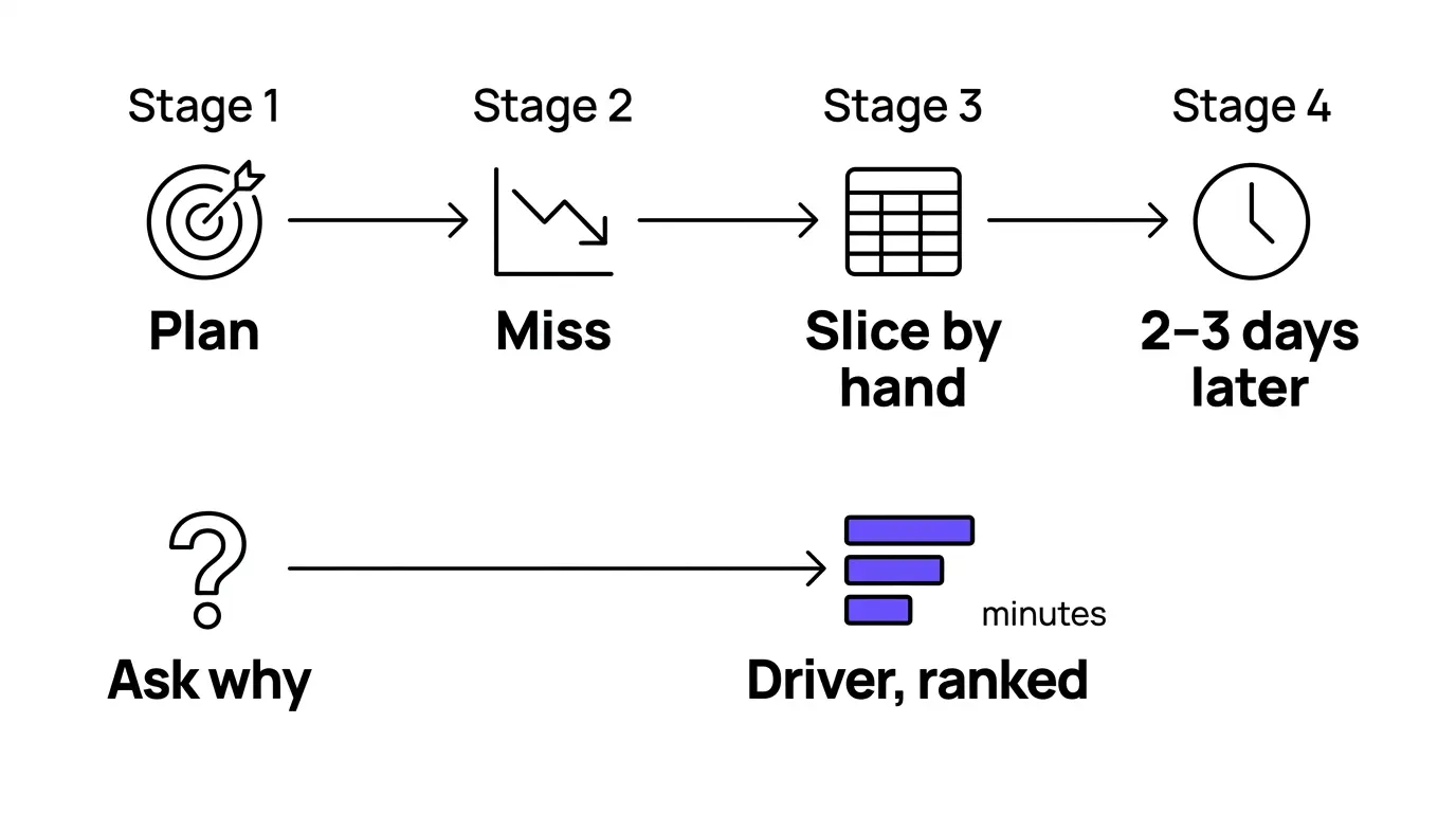
The forecast said net new ARR would land at $4.2M. It came in at $3.6M. The plan gave you the target and the dashboard gave you the miss. Neither told you why. Maybe pricing softened in one segment; maybe the miss was a cohort that churned harder than the model assumed. Either way, finding out is manual work. An analyst opens the warehouse, slices by segment, then by region, then down to the cohort, rebuilds the bridge in Excel, and two or three days later has an answer. By then the review has already happened and the next month has started.
This is the part most "AI for FP&A" claims skip, including the ones already in your stack.
Where in-model copilots stop
Partly. Those copilots answer questions well when the question lives inside the model you already built. They read the dimensions the modeler defined and summarize the variance the model was built to show. What they don't do is reach past the model into the granular operational data underneath it, because that data was never loaded into the plan. And the driver behind a variance usually lives exactly there, one level below where the planning model stops: in the transaction detail, the CRM, the billing system, the deductions file. A copilot that sees only the plan can tell you the mid-market segment missed. It can't tell you the miss was three accounts that downgraded at renewal after a specific product change, because none of that is in the model.
Text-to-SQL isn't diagnosis
This one lands harder if your data team has already stood up a semantic layer. Text-to-SQL tools built into the warehouse answer the question you ask and hand back the number. Ask for net revenue by region, get net revenue by region. But diagnosis isn't one question. It's the twenty you didn't think to ask, run across every dimension until the driver falls out and ranks by contribution. Text-to-SQL returns the value you requested. Automated diagnosis searches the space you didn't know to query and shows which factors moved the number, and by how much. One answers what you asked. The other finds what you missed.
The same gap, different drivers
It shows up in every finance function; only the drivers change. A consumer-goods FP&A team staring at a gross-margin miss doesn't care about ARR cohorts. They need to know whether the erosion came from trade-spend that didn't convert at one retailer, or a mix shift toward lower-margin SKUs that nobody flagged until the margin line moved. The question has the same structure everywhere: what actually moved this number. And the manual answer takes the same two or three days. Wherever a finance team owns a variance it can't explain in the meeting, that's the diagnosis gap.
Does this require clean, perfectly modeled data first?
No. The analysis layer reasons on top of the governed semantic layer you already maintain. It consumes your metric definitions instead of inventing its own, so "net revenue" means what your data team says it means, not what a second tool decided on its own. It reads the data in place, in your warehouse, against the definitions you already govern. It won't fix data quality; nothing can promise that. But it will reason across the data you have, using the definitions you've already set.
That's the job Tellius is built for. Tellius is Decision AI for the enterprise — the intelligence layer connecting your data to your decisions. It runs alongside the planning platform you already own and does the one thing that platform structurally can't: explain the why behind the number, across the granular data, with the reasoning shown.
Where Tellius fits in your finance stack
Tellius is the AI analysis layer for FP&A. Its agents unify the data across your source systems — warehouse, CRM, billing, ERP, transaction detail — and reason across it to explain the variance your plan can't. It sits in a specific place: on top of the warehouse and the governed semantic layer your data team already maintains, and alongside your planning platform rather than in front of it. The plan stays where it lives. Tellius reads the detail underneath it and answers the why.
Tellius doesn't build your budget or run your consolidation, and it isn't where your forecast model lives. If you need connected enterprise planning, the platforms named earlier are built for it, and Tellius isn't trying to replace them. Buy the planning platform that fits your tier; add Tellius for the part it doesn't cover.
Because it's a layer, it works with whatever you already run. Whether your plan lives in a connected platform like Anaplan or Adaptive, or in a spreadsheet a controller has kept for six years, Tellius reads the same granular data and explains the same variances. A lean finance team on a spreadsheet gets the same diagnosis a global enterprise on a connected platform does. Nothing gets ripped out.
And it doesn't make the call for you. Tellius does the analysis and hands back finished work a person reviews before it goes anywhere — it explains the why and points to the next move, but the analyst still checks it and the finance leader still signs it. What's gone is the two or three days of manual slicing between a question and its answer. What stays is the reasoning, left visible, so you can trust what you're putting your name on.
Keep the platform that plans. Add the layer that explains.
What "doing the work" actually looks like
Your team closes the month and operating income lands about $600K under plan. In the old workflow, an analyst disappears into spreadsheets for a week: actuals pulled apart segment by segment, then cohort by cohort, the bridge rebuilt by hand, department owners blaming timing. The answer arrives after the business review instead of before it. At one software company, weekly reporting alone ate a third of the FP&A team's time.
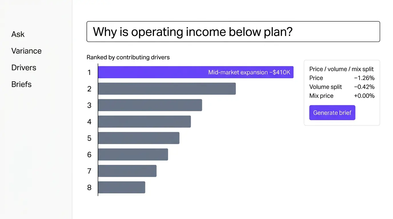
Run the same variance through the analysis layer and it comes back as a decomposition. The miss concentrates in mid-market, on the expansion line rather than new logo, and underneath it the driver ranks out: a set of accounts that renewed flat instead of expanding, clustered right after a product change, each one's contribution measured against plan. Price, volume, and mix come apart, so "we sold less" and "we sold cheaper" don't get confused. The reasoning stays visible — which dimensions it searched, how much each moved the total — so the analyst can check the work and the Director can sign it. What lands is a finished brief in your format, ready for a person to review and sign.
That's the difference between a tool that flags the miss and one that explains it. When the slicing and bridge-building come off the analysts' desks, the reclaimed hours go to the business instead of the spreadsheet; at one manufacturer, the close cycle came down by half. Across teams that make the shift, three-to-five-day variance analysis runs in hours, and forecast accuracy improves as bias surfaces earlier, in one case from 78% to 92%. Treat those as directional, not guarantees; they come from specific companies under specific conditions.
What AI agents make possible in FP&A
Finance runs on data that lives in different systems — the GL, the CRM, the billing platform, the data warehouse, the planning model itself. The reason diagnosis is slow by hand is that answering a single variance question means pulling from several of them and reconciling the pieces. This is the part an AI agent changes. It unifies the data across those sources first, then does the analytical legwork on top of the combined picture: reaching into the detail, following the variance down through the dimensions, and assembling the answer. Because it reads the sources together, it isn't limited to what any one tool can see.
A few of the workflows finance teams are putting agents on:
Trace an ARR miss across CRM, billing, and the GL. Net new ARR lands under plan. An agent pulls opportunities from the CRM, invoiced revenue from billing, and booked revenue from the GL into one view, then decomposes the gap — new logo versus expansion, by segment, down to the accounts that renewed flat — and ranks each driver by contribution. The three systems that used to mean three exports and a manual reconciliation get read together.
Watch gross margin and draft the brief before the review. A monitoring agent runs the margin variance on a schedule. When erosion crosses a threshold, it separates price, volume, and mix, checks trade-spend and SKU shifts against plan, and drops a finished brief into the analyst's queue ahead of the business review, with its reasoning shown.
Ask an open "why" and get the whole search back. Instead of writing the query, an analyst asks why DSO climbed last quarter. The agent runs the analysis across every dimension that could move the number — customer, region, payment terms, collector — and returns the ones that did, ranked, rather than the single cut the analyst thought to pull.
Pressure-test a forecast assumption against the actuals underneath it. Before a reforecast, an agent compares the driver assumptions in the plan against what the granular data actually did last cycle, and flags where the model's logic and the real behavior have drifted apart, so the bias gets caught before it's baked into the next number.
In each case the agent unifies the sources, does the analysis, and hands back finished work a person reviews. The judgment stays with the analyst. The days of manual assembly are what go away.
The four levels of variance analysis, from manual to continuous
Not all "AI variance analysis" means the same thing. It helps to place the options on one axis: how much of the diagnosis the tool actually does, versus how much the analyst still does by hand.
Level 1 — Manual. The variance shows on a dashboard; a person opens a spreadsheet and slices until the driver appears. Most legacy reporting and the base tier of any planning tool live here. The tool shows the miss; the human finds the cause.
Level 2 — Assisted. An in-model copilot summarizes the variance and answers follow-up questions about it, along the dimensions the model already holds. The AI copilots shipping in the major planning platforms sit here. Faster than manual, still bounded by what the model contains.
Level 3 — Automated diagnosis. The tool searches across the granular data on its own, ranks the drivers by contribution, separates price, volume, and mix, and returns the explanation with its reasoning shown. This is where Tellius operates, on data that reaches past the planning model.
Level 4 — Continuous. The analysis runs as scheduled monitoring, surfacing the why behind a moving number before anyone asks and pushing a finished brief ahead of the review. Tellius runs here too, through monitoring that watches the metrics and reports back, always with a person reviewing before anything is acted on.
Most tools in this guide operate at Levels 1 and 2 on this axis. Tellius is the one built for Levels 3 and 4.
How to evaluate the diagnosis axis, and make the case internally
If you're adding an analysis layer rather than swapping planning tools, the evaluation criteria are different from a planning RfP. Five questions separate real diagnosis from a copilot with a chat box.
Does it reason across data outside the planning model? This is the single most important test. A tool that only reads the plan can only explain what's in the plan. Ask to see it find a driver that lives in operational data — CRM, billing, transactions — that was never loaded into a planning model.
Does it rank drivers, or just answer the one question you asked? Returning a number on request is text-to-SQL. Searching the dimensions you didn't think to query and ranking what moved the total is diagnosis. Ask it an open "why," not a closed "what."
Can you see its work? For anything going in front of a CFO or an audit committee, the reasoning has to be inspectable: which dimensions were searched, how much each contributed. A single figure from a black box won't survive the review.
Does it use your governed definitions? The tool should consume the semantic layer your data team already maintains, not stand up a second definition of "net revenue" that drifts from the first. Confirm this with whoever owns your warehouse before you buy.
Does a person stay in the loop? The output you want is finished work a human reviews and signs, not an autonomous decision. Make sure the review step is real.
Making the case to your CFO and your data team
Two people usually decide whether an analysis layer gets in: the CFO who funds it and the data leader who has to allow it access. Each asks a different question.
The CFO asks why not just use the copilot in the platform you already pay for. The one-line answer: that copilot only sees the planning model, and the drivers you spend days chasing live in the data underneath it. Frame the return as reclaimed capacity — analyst hours that move from manual slicing to business partnering, on the order of the close-cycle and reporting-time reductions cited earlier.
The data leader asks whose data this touches and whether it builds a competing semantic layer. Bring them in early, and bring the answer with you: it reasons on top of the definitions they already govern, reads data in place, and doesn't redefine metrics. An analysis layer that respects governance is one the data team can champion instead of block.
The honest version of "best"
The most useful thing a best-of list can tell you is what a tool isn't for. So, plainly: if you need to build the plan, buy the planning platform that fits your tier — this guide names the strong ones by size and by how much you love Excel. Tellius won't do that job.
What Tellius does is the job that starts after the plan is built and the month closes: explaining, across your granular data and with the reasoning shown, why the actuals came in where they did. That's the question the planning platforms weren't built to answer, and it's the one finance teams still answer by hand. If that's the gap you feel every close, it's worth seeing on your own data.
Disclosure: This comparison was researched and published by Tellius. We've aimed for factual accuracy on every platform named and have been explicit about where Tellius does and doesn't fit — it's an analysis layer, not a planning tool. Capabilities and product names reflect what vendors shipped at the time of writing; verify current details with each vendor.
Get release updates delivered straight to your inbox.
No spam—we hate it as much as you do!


There's no single best FP&A platform; the right planning tool depends on your size, Excel-dependence, and modeling complexity. For connected enterprise planning, Anaplan and Workday Adaptive Planning are common picks; for consolidation-heavy finance, OneStream and Oracle Cloud EPM; for Excel-native teams, Vena, Cube, and Datarails. For the separate job of explaining why actuals missed plan, Tellius is the analysis layer built to diagnose variance across granular data and pairs with any of them.
Tellius is built specifically for this — it decomposes a variance to its driver across granular data and shows its reasoning. The major planning platforms (Anaplan, Workday Adaptive, Oracle Cloud EPM, OneStream, Pigment) now ship AI copilots that summarize variance inside the planning model, but they don't reach into the operational data below the model where the driver usually sits. That boundary is the difference between summarizing a variance and diagnosing it.
Start there if it answers your questions — for many in-model questions it will. The copilot's limit is structural: it sees the dimensions in the planning model and not the granular operational data underneath. When the driver behind a miss lives in the CRM, billing, or transaction detail that was never loaded into the plan, the in-model copilot can't reach it. Tellius reasons across that underlying data, which is why it runs alongside the planning platform rather than inside it.
No, and it isn't meant to. Tellius doesn't build budgets, run consolidations, or hold your forecast model. Keep Anaplan, Adaptive, Oracle EPM, OneStream, or whichever planning platform fits your tier, and add Tellius as the analysis layer on top to explain the variances the plan produces. It pairs with your planning stack, including a spreadsheet if that's what you run.
Alongside them, one level down in the data. Anaplan and Adaptive own the plan and the modeled dimensions; Tellius reads the granular data underneath the plan and explains why the actuals diverged from it. The two aren't competing purchases — one builds the forecast, the other diagnoses the miss.
Warehouse text-to-SQL answers the specific question you ask and returns the number. Tellius runs automated diagnosis: it searches across the dimensions you didn't think to query, ranks the drivers by how much each moved the total, and shows the reasoning. Text-to-SQL is built to fetch a value; diagnosis is built to find the cause you didn't know to look for.
Yes. The diagnosis gap is the same across verticals; only the drivers change. A SaaS team traces a miss to expansion cohorts, a consumer-goods team to trade-spend or SKU mix, a pharma finance team to gross-to-net or channel dynamics. Tellius reasons over whatever granular data defines your business, so the analysis fits the vertical rather than assuming a SaaS revenue model.
Because it reads the data and definitions you already have rather than requiring a new planning model to be built, an analysis layer stands up faster than a planning-platform implementation, which can run months. Timelines depend on your data's readiness and how your semantic layer is governed; connecting to an existing, well-defined warehouse is the quick path.
Planning platforms vary widely — enterprise suites like Anaplan and Oracle EPM run into six figures annually with implementation on top, while Excel-native and startup tools price far lower. An analysis layer is priced separately from planning software because it does a different job; scope it against the analyst hours it reclaims rather than against your planning-tool budget. Ask each vendor for pricing on your data volume and user count.
No. It removes the manual slicing and bridge-building, not the analyst. The reclaimed hours move to the work the grind was crowding out — partnering with the business and pressure-testing the plan. The output is finished work a person reviews and signs, so the analyst's judgment stays in the loop; what changes is how they spend their time.
.webp)
14 Best AI Tools for Finance Teams in 2026 | Comparison Guide

AI is rapidly reshaping how finance teams plan, analyze, and report on business performance. This guide compares 14 of the best AI tools for finance teams in 2026, covering platforms for financial analysis, forecasting, reporting, and automated insights. It explains how modern AI tools help finance professionals move beyond spreadsheets and manual reporting by automating data integration, uncovering drivers behind financial performance, and generating faster forecasts and variance explanations. The article also provides a practical framework for evaluating finance AI tools—highlighting which platforms are best for FP&A, financial analysis, operational planning, and executive reporting in today’s AI-driven finance stack.